About This Project
Visual Identity & Packaging
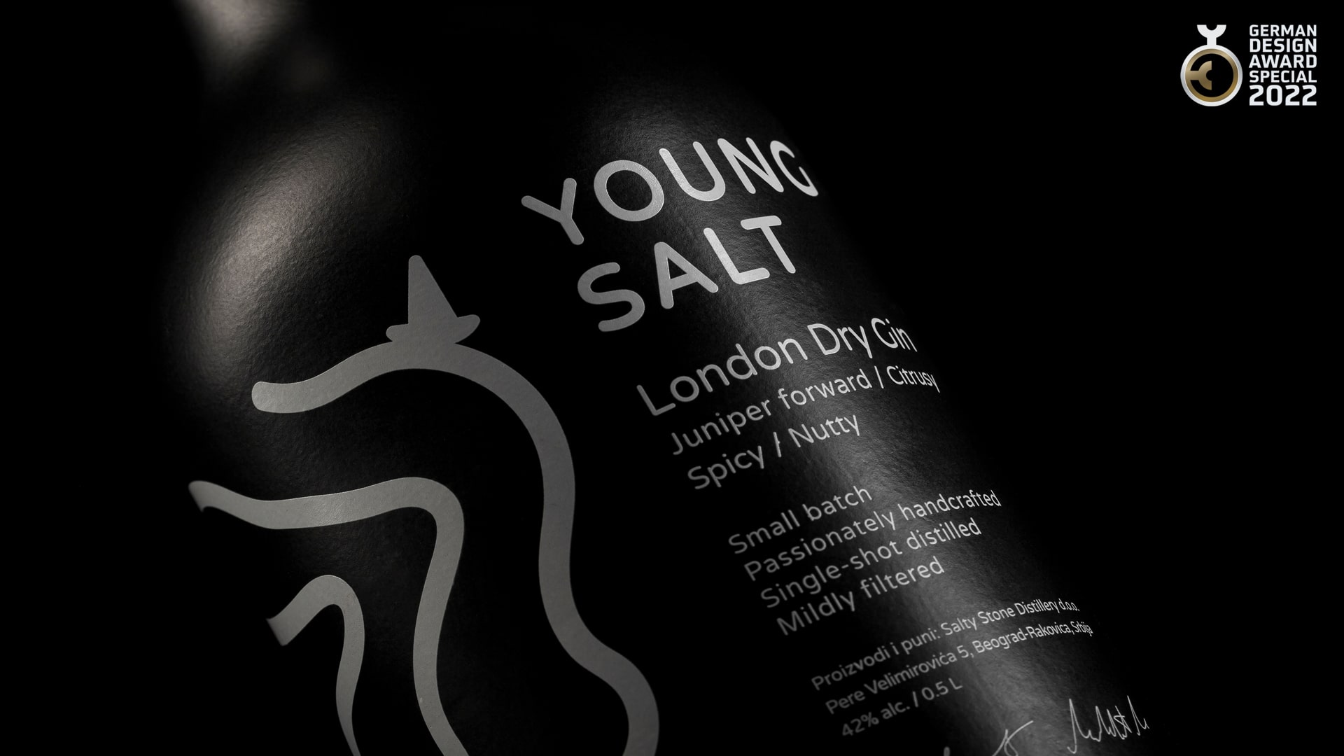
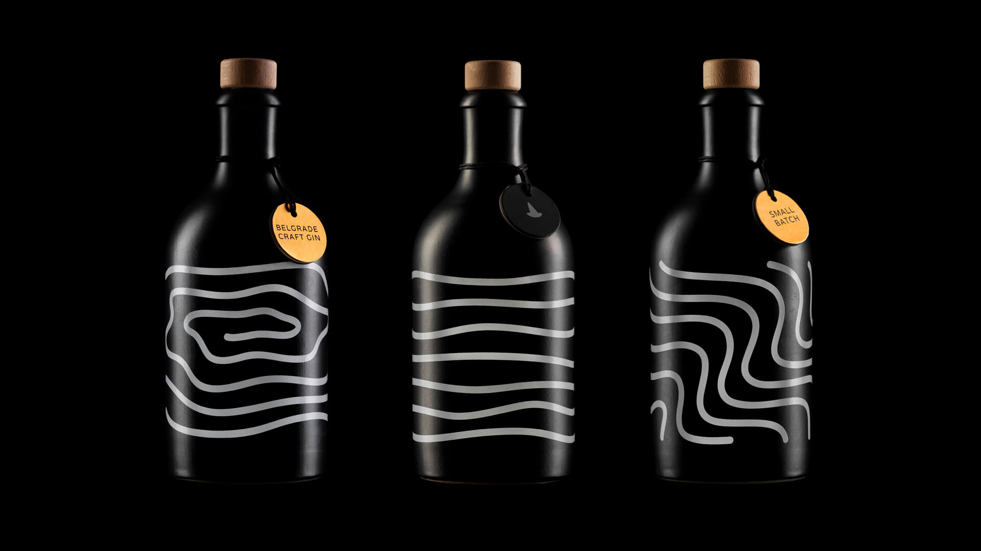
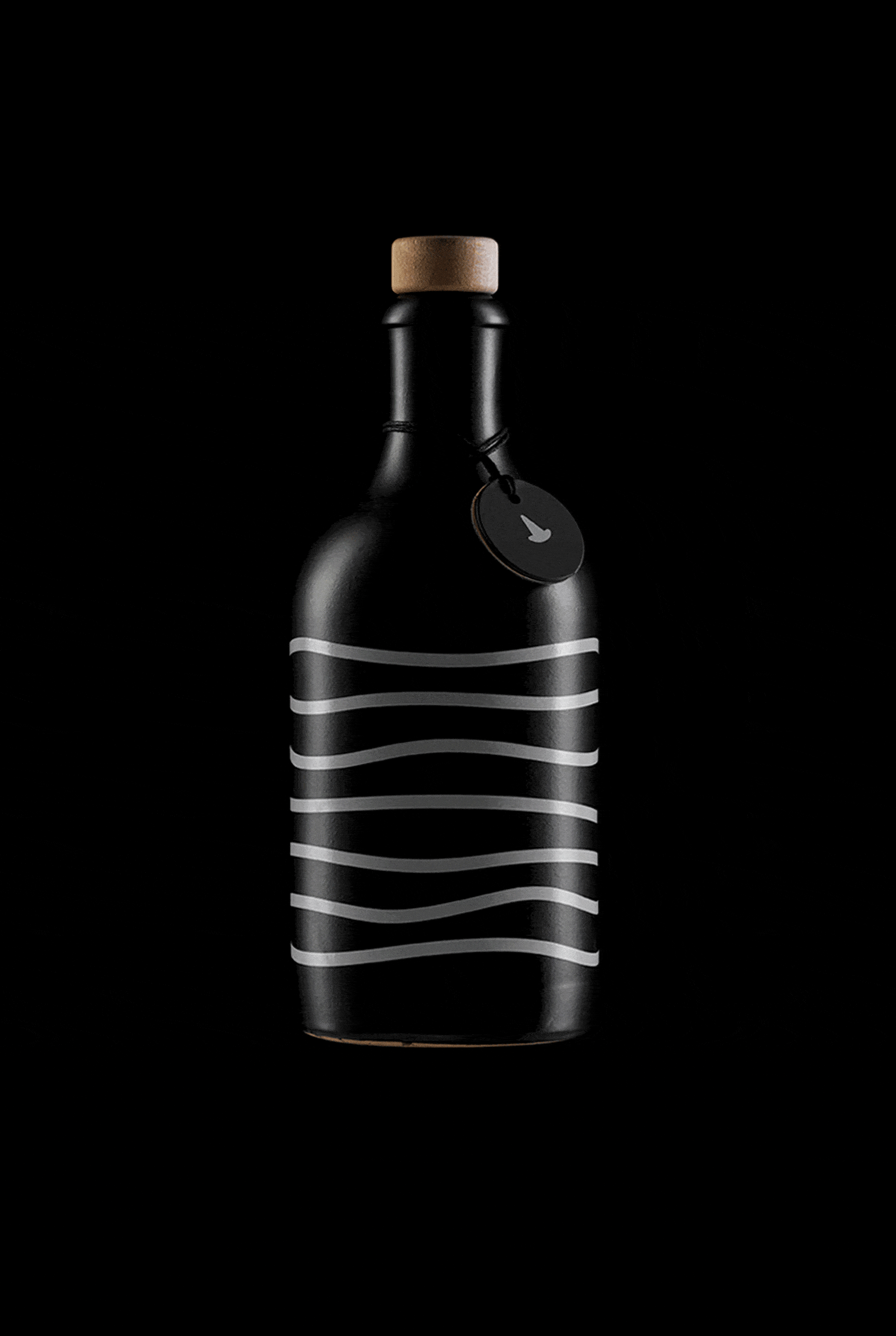
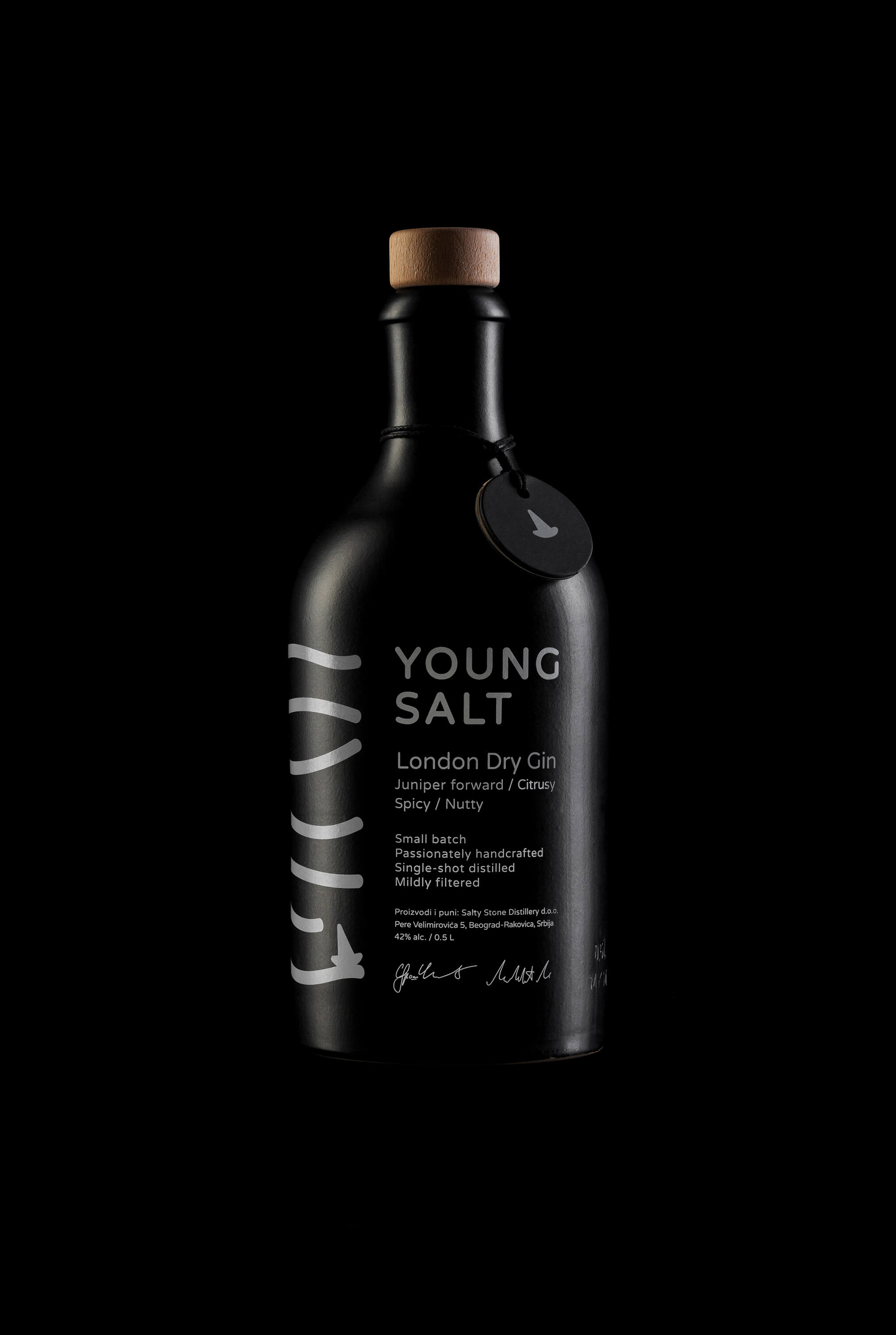
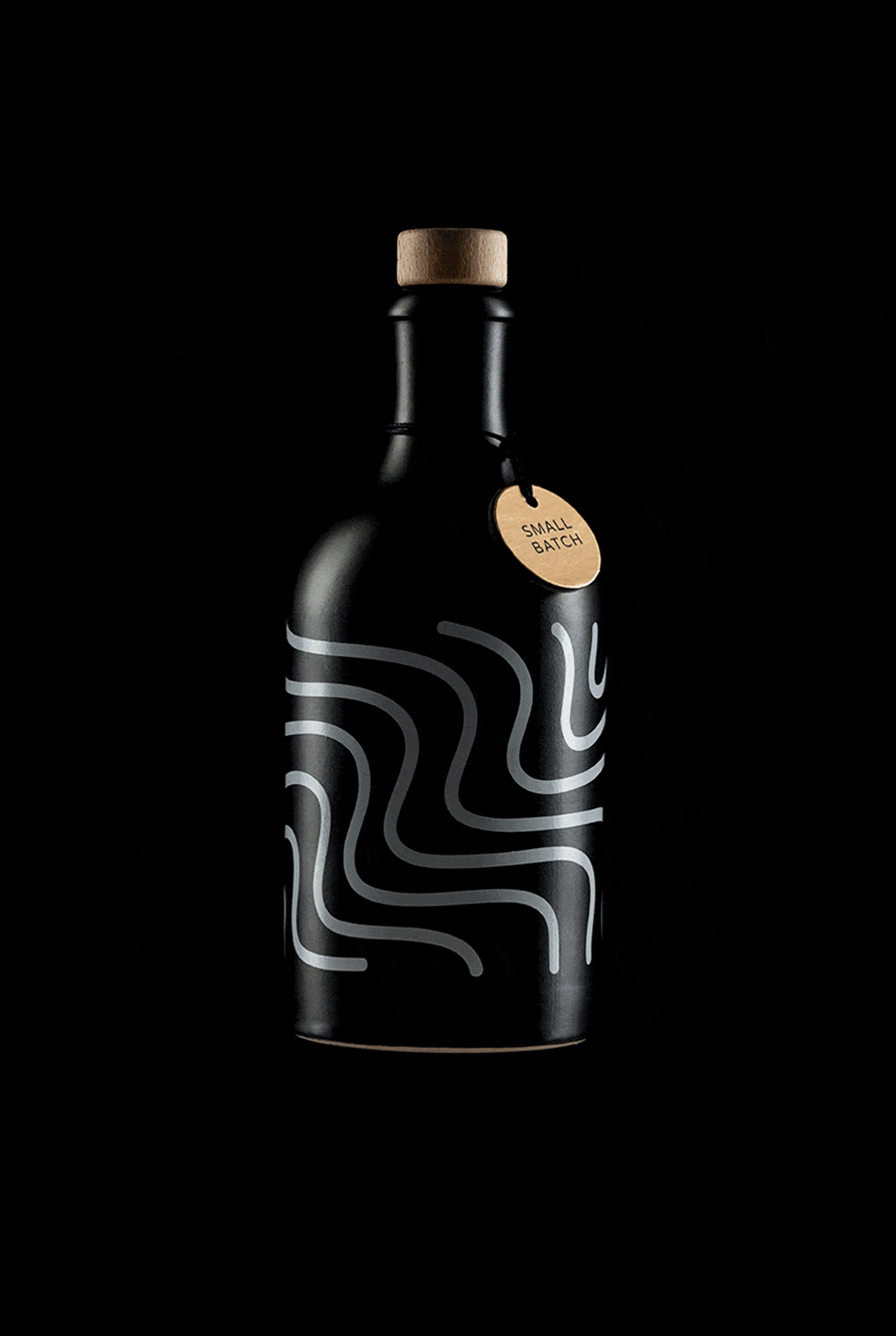
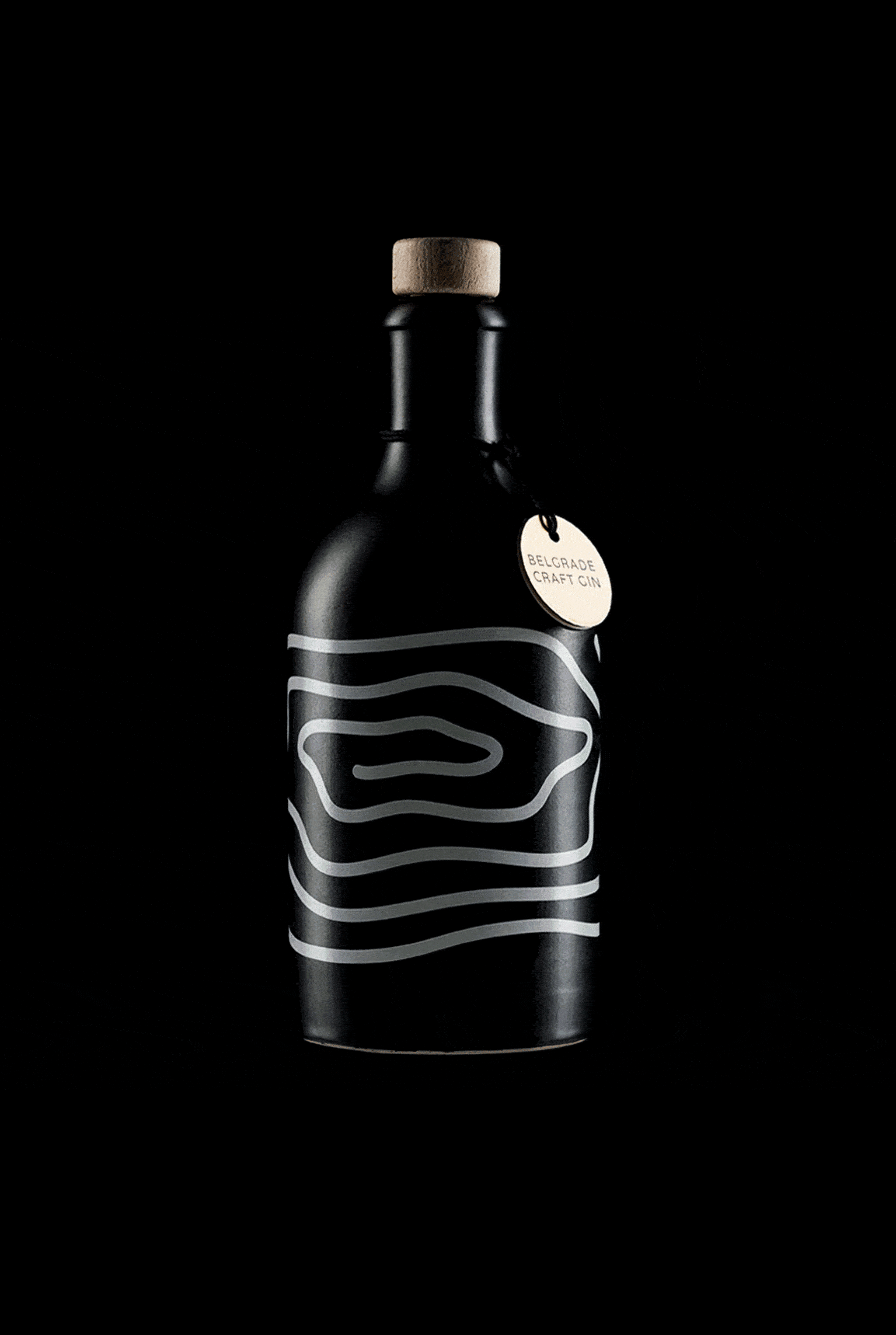
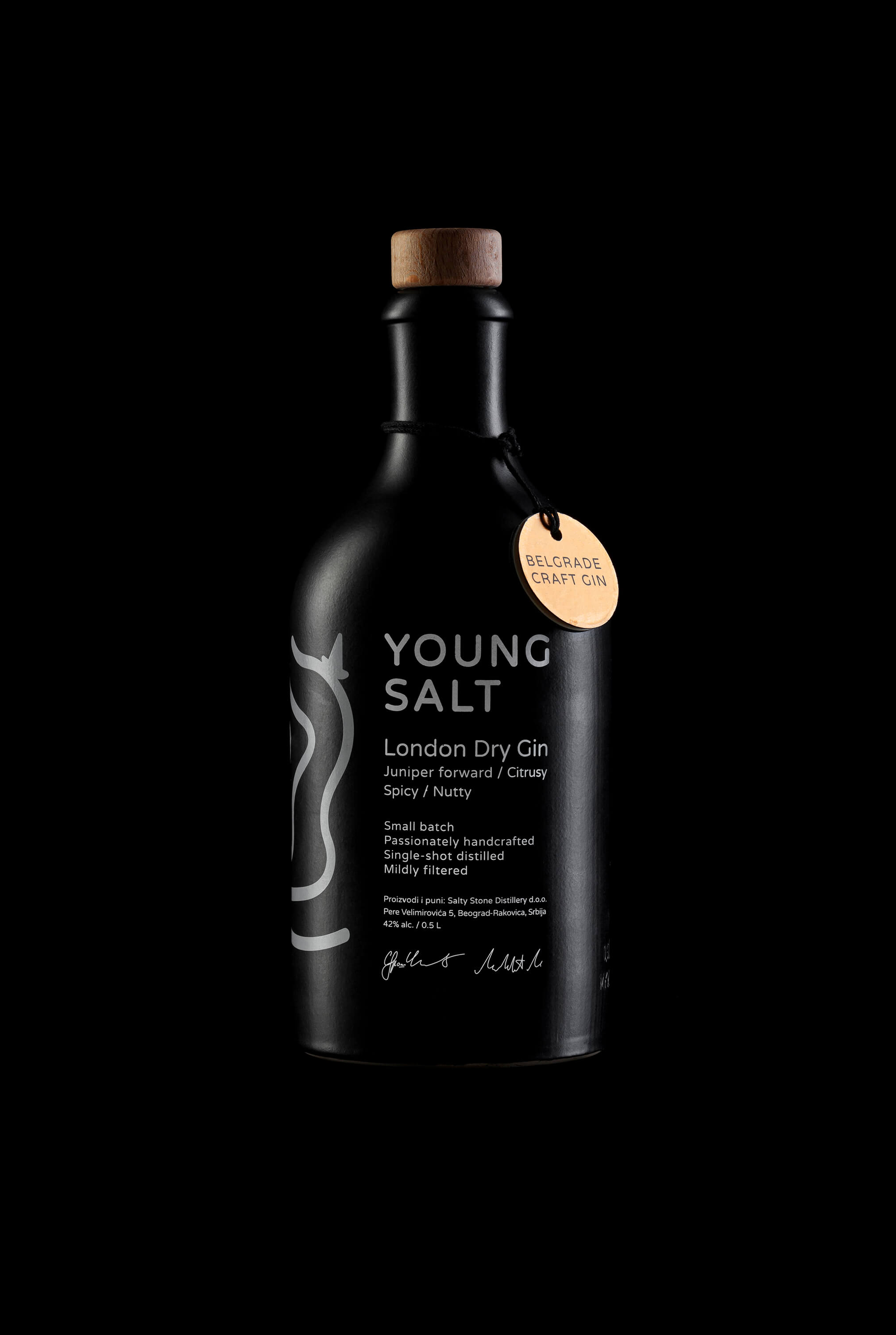
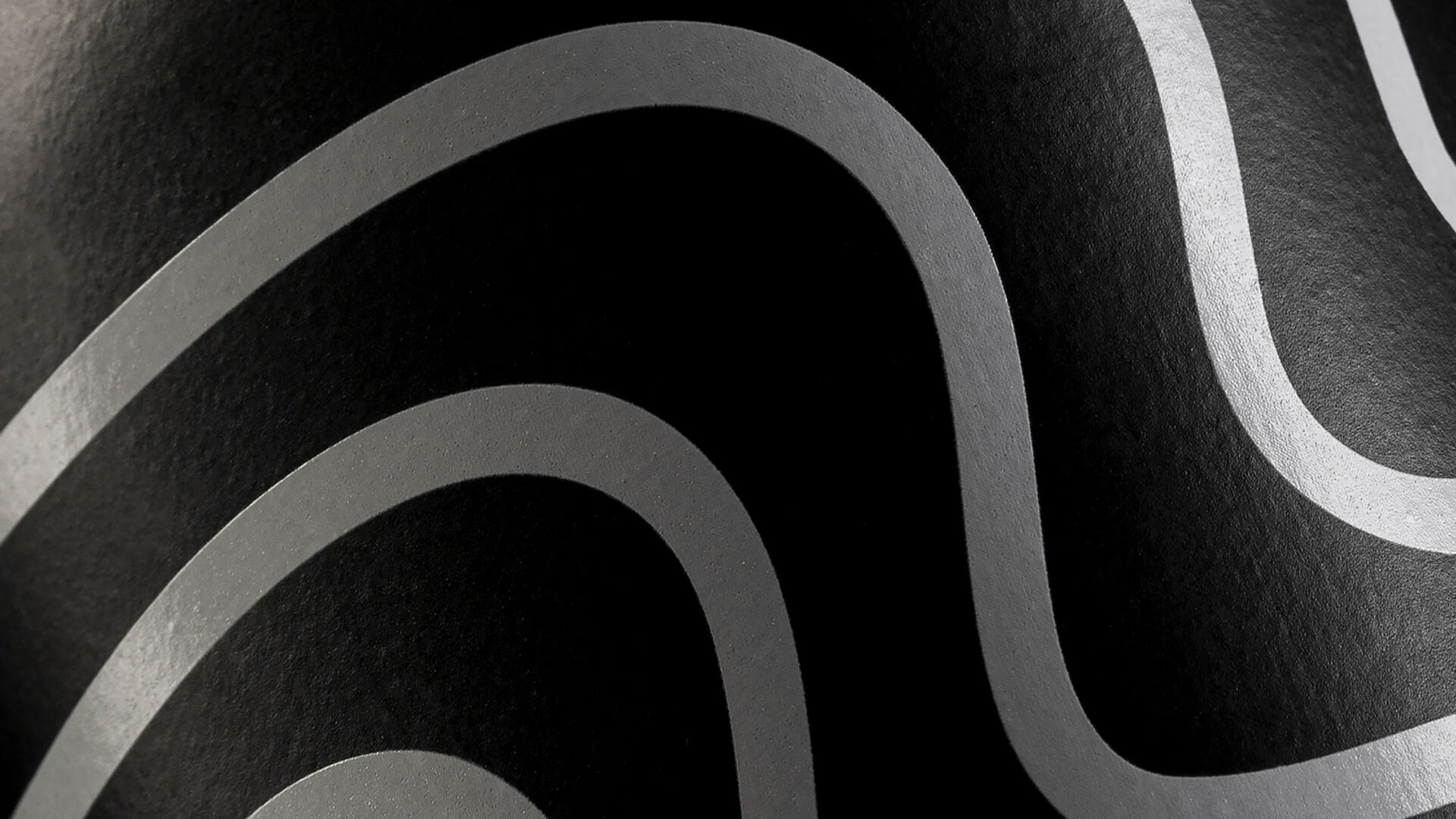
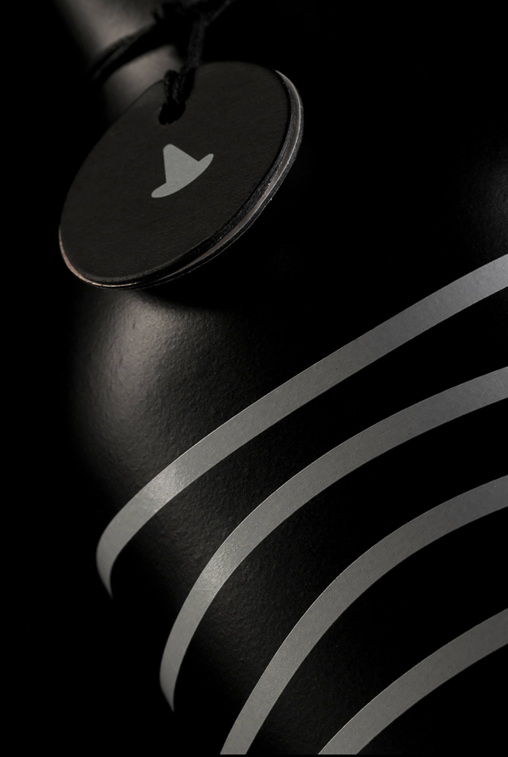
Young Salt is a contemporary London Dry Gin passionately handcrafted in Belgrade, Serbia. The idea behind the design concept was to portray the experience of gin itself with the story of a journey one makes through his life while sailing on different seas. Calm sea, waves, and whirlpools as three different states can be seen at many levels. Series can be seen as a literal illustration of liquid in the bottle, illustration of a sea, as well as possible life journey situations and moreover journey of the creators in crafting of Young Salt Gin. Young Salt is the name used to depict a young sailor who's just starting his incredible journey. The name itself is derived from the term "Old Salt", an expression for an experienced sailor who is a raconteur of his stories that pass from generation to generation. One day he will become Old Salt, the one who tells astonishing and inspiring stories sitting in front of the fireplace, surrounded by the ones just like himself was when he was young. The history of gin as a drink and the fact that Young Salt is distilled in Belgrade where once the Pannonian sea was, resulted in the idea and the approach to design the brand's visual identity. Legends of gin making are spoken by different ‘sailors’ and this one is special in many ways as this is a family story created by two brothers Marko and Uroš with passion and care in the search for taste, aroma and ultimate experience of handcrafted gin. Young Salt as such is an abstract concept that reflects that enthusiasm, energy, a spark from which everything was created. Visual perception of the labels changes as the bottle is rotated, allowing spectators to see only the pattern of lines as a “front” label. Rotating the bottle illustration of a ship is changing that pattern of lines into an illustration of a sea. In that way, design is playing with perception and is allowing visual stories to unfold. Bottles are produced in Germany as well as printing of designs in a family run, craft businesses. The idea of one-color print on a black mate ceramic bottle as a minimalistic design approach resulted in a unique brand with clear and strong visual language, however, also raising the awareness of sustainability and reusability, especially important in the present moment of our lives. Namely, the bottle is made from ceramic with solely printed and no additional labels on it, from virtually indestructible material that can resist the challenge of time passing by and be indefinitely recycled or upcycled. Project is awarded by the German Design Awards GDA2022 with a Special Mention Award for Excellent Communication Design in a Brand Identity category.


CD, AD, Graphic design: Stefan Knežević
Photography: Petar Jelisavac
Year: 2020