About This Project
Craft Beer Brand Identity & Packaging
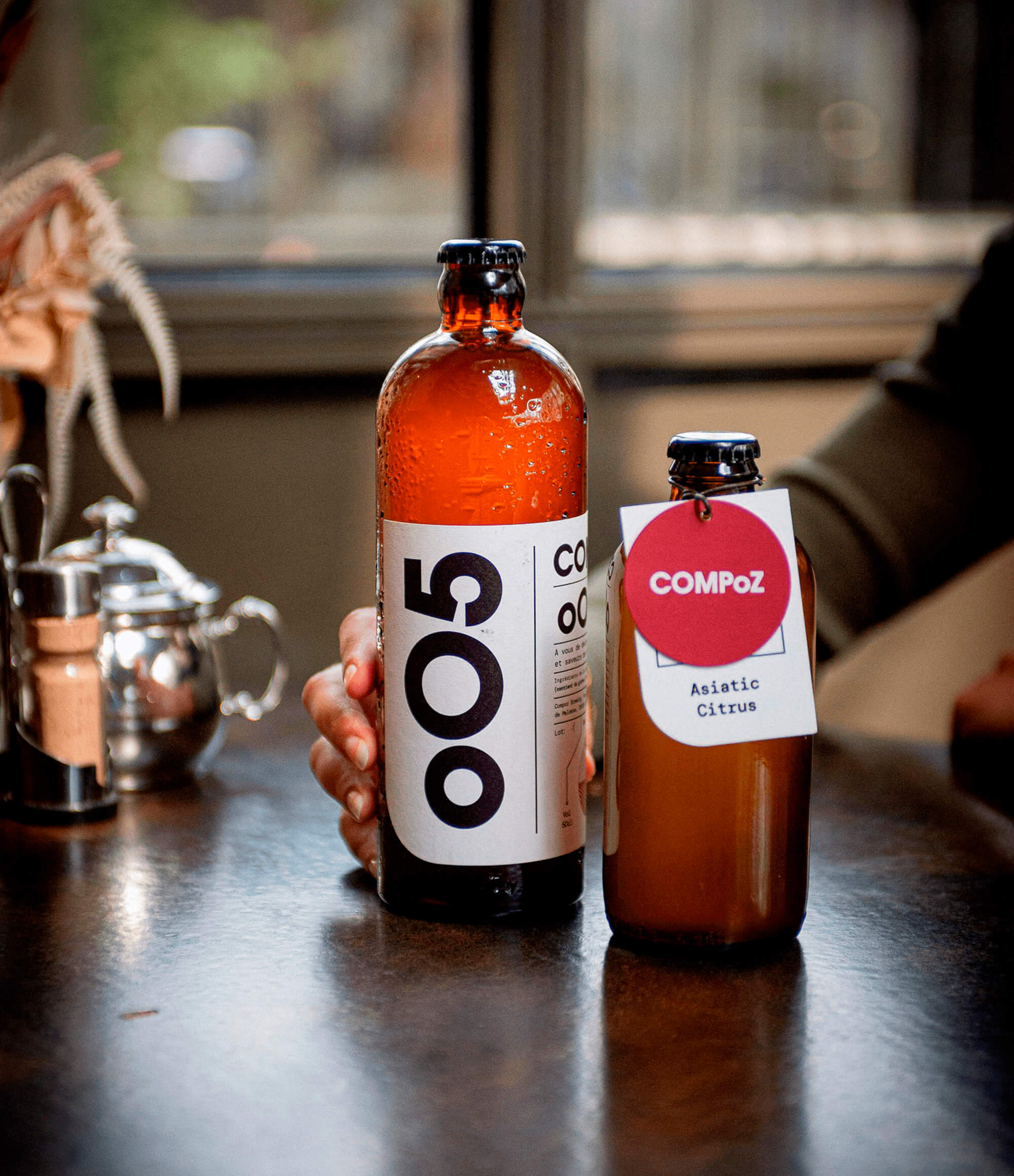
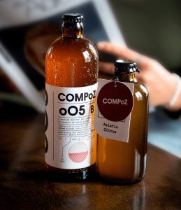
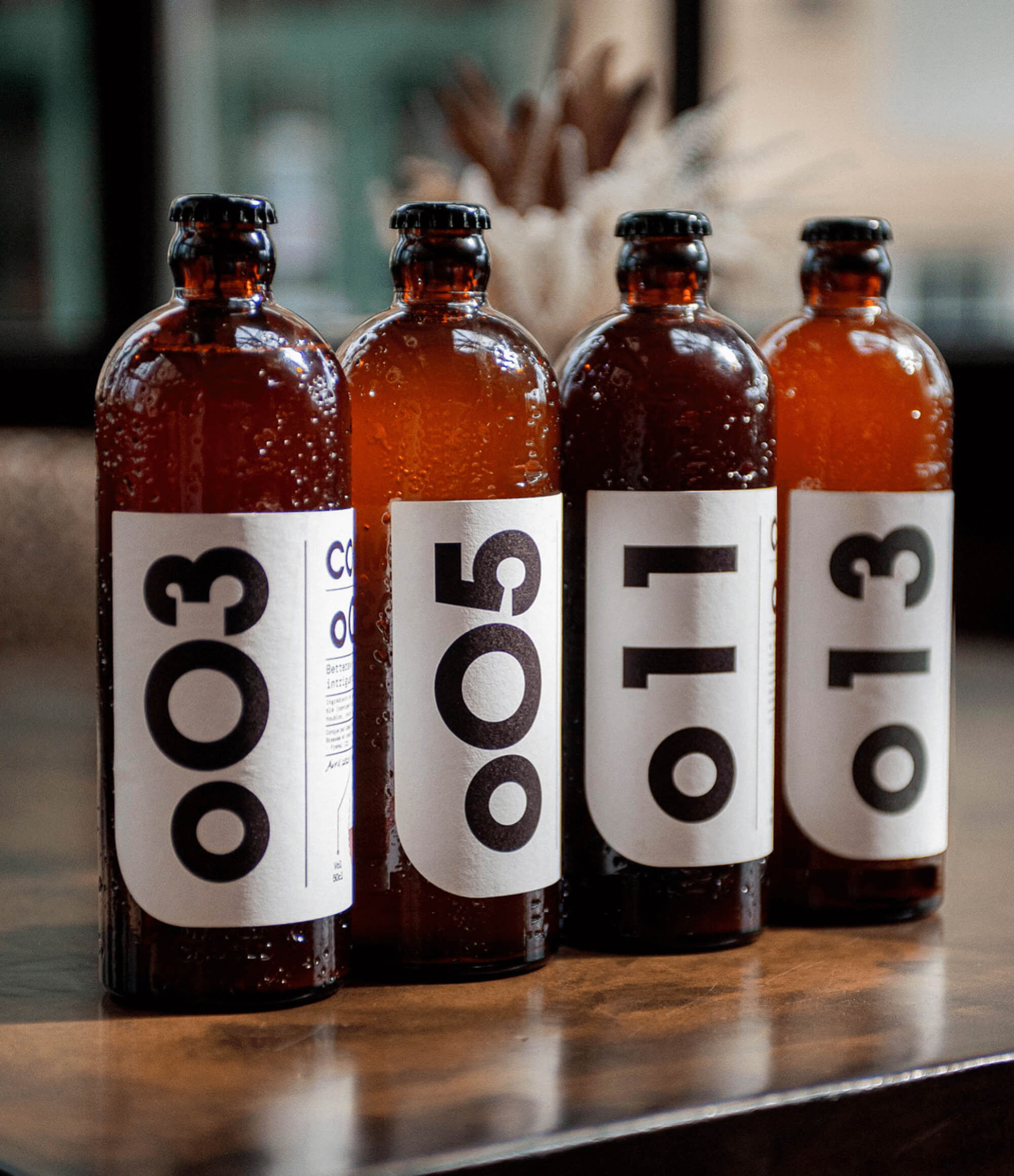
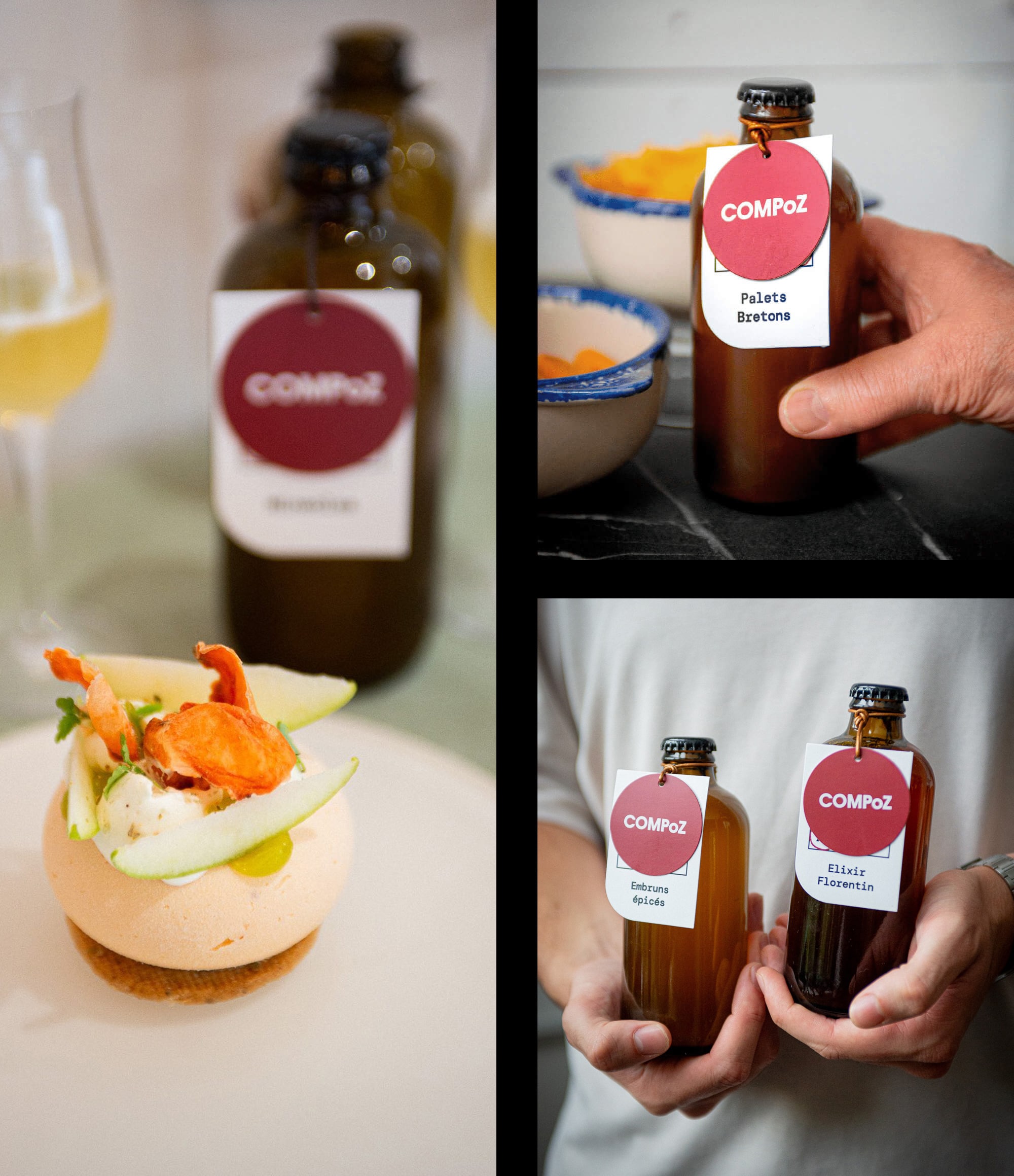
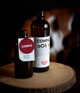
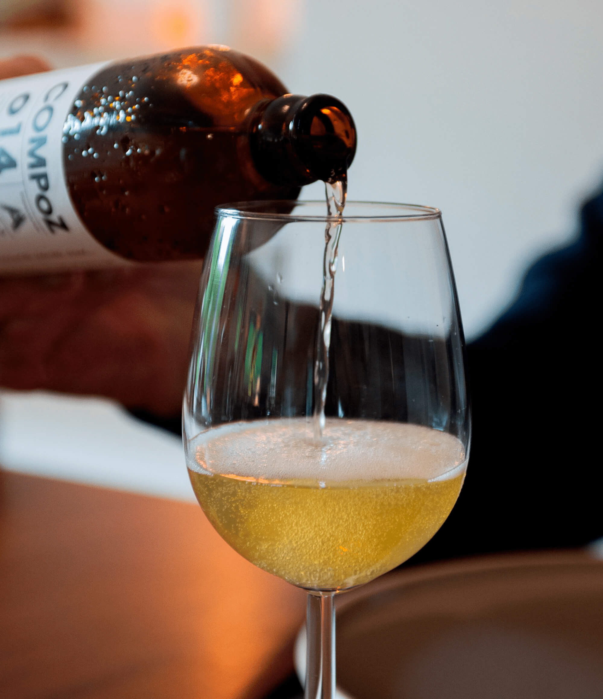
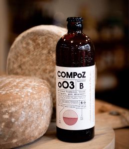
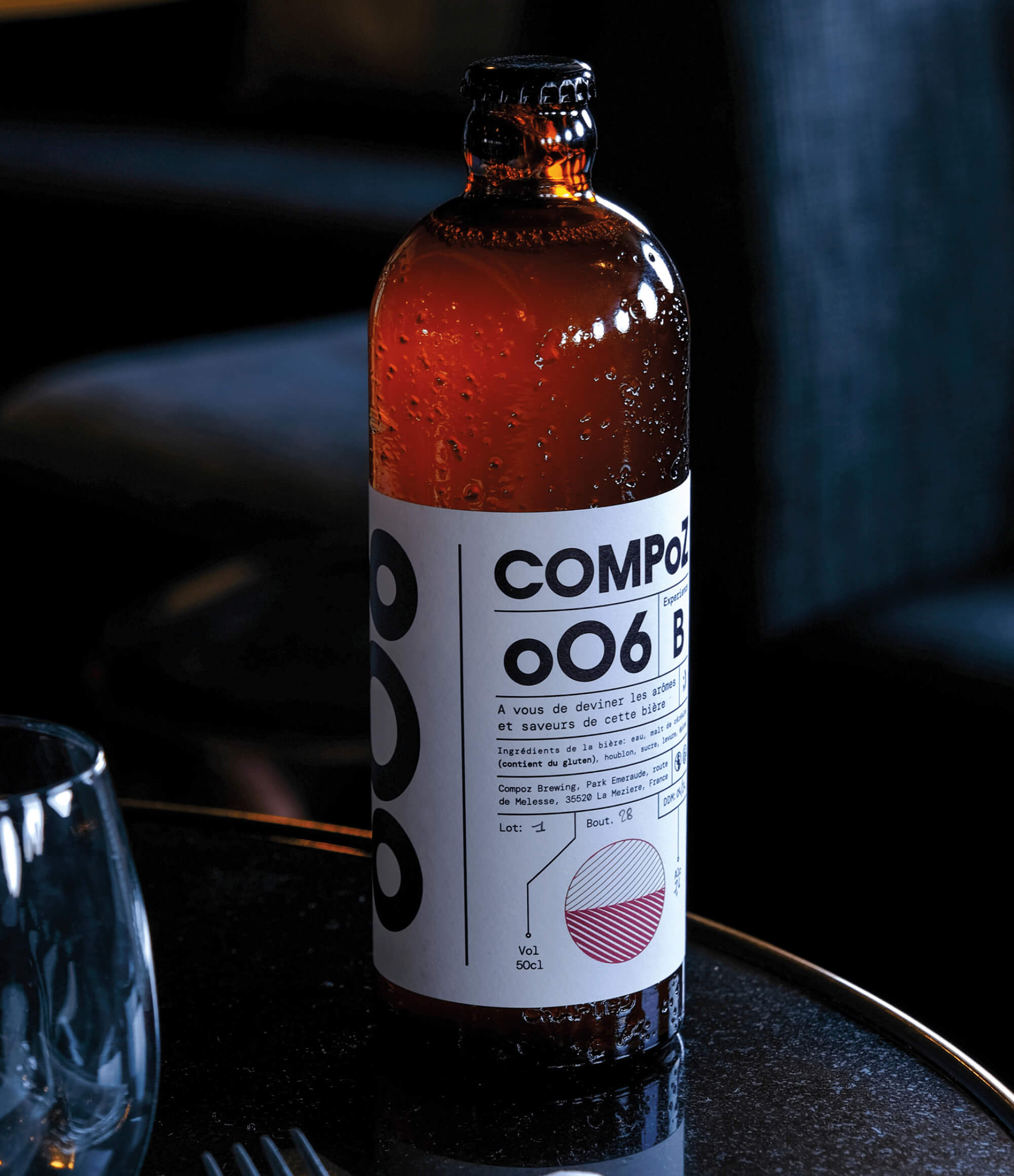
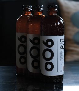
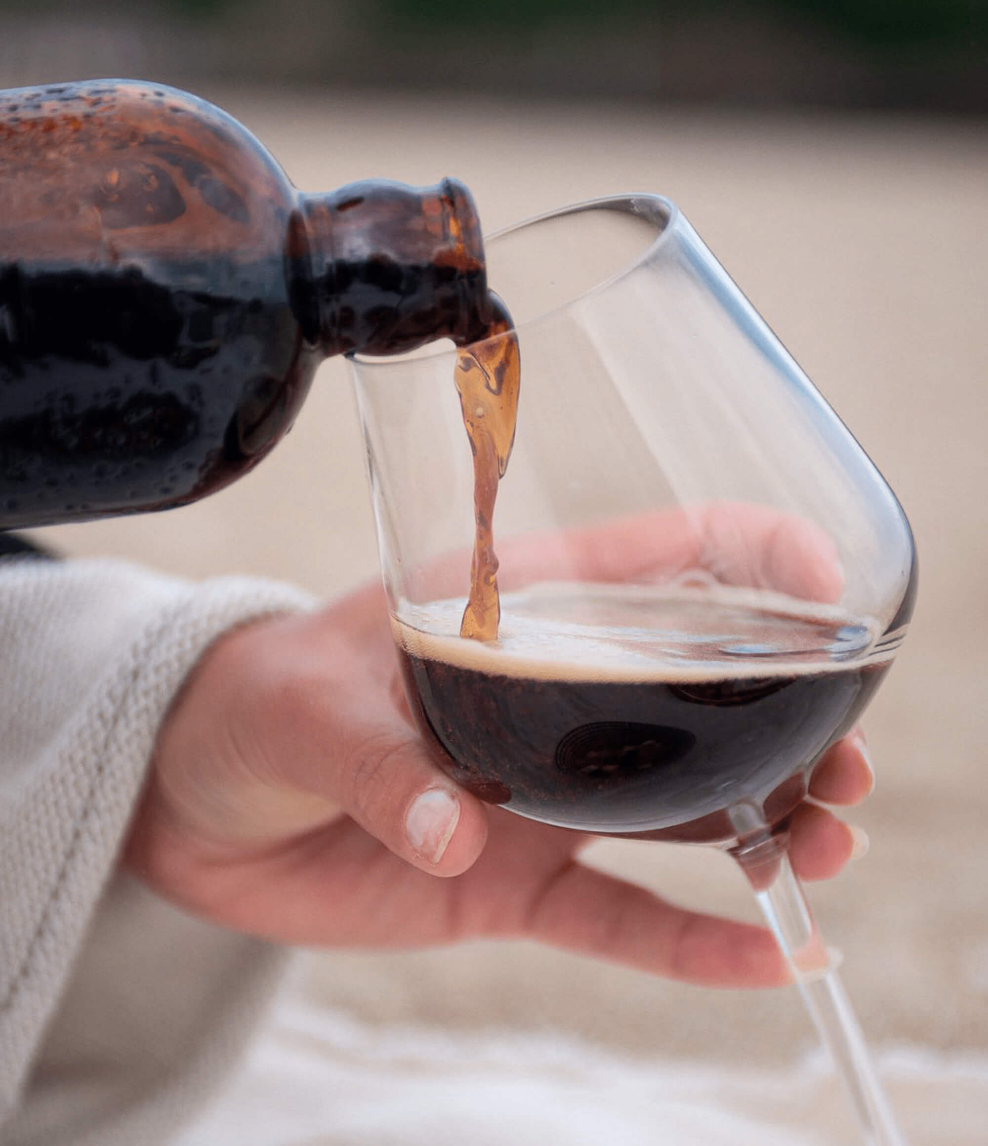
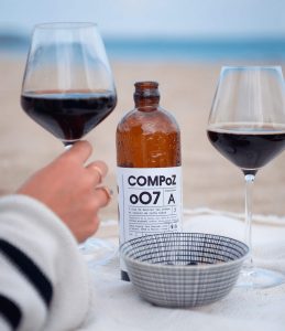
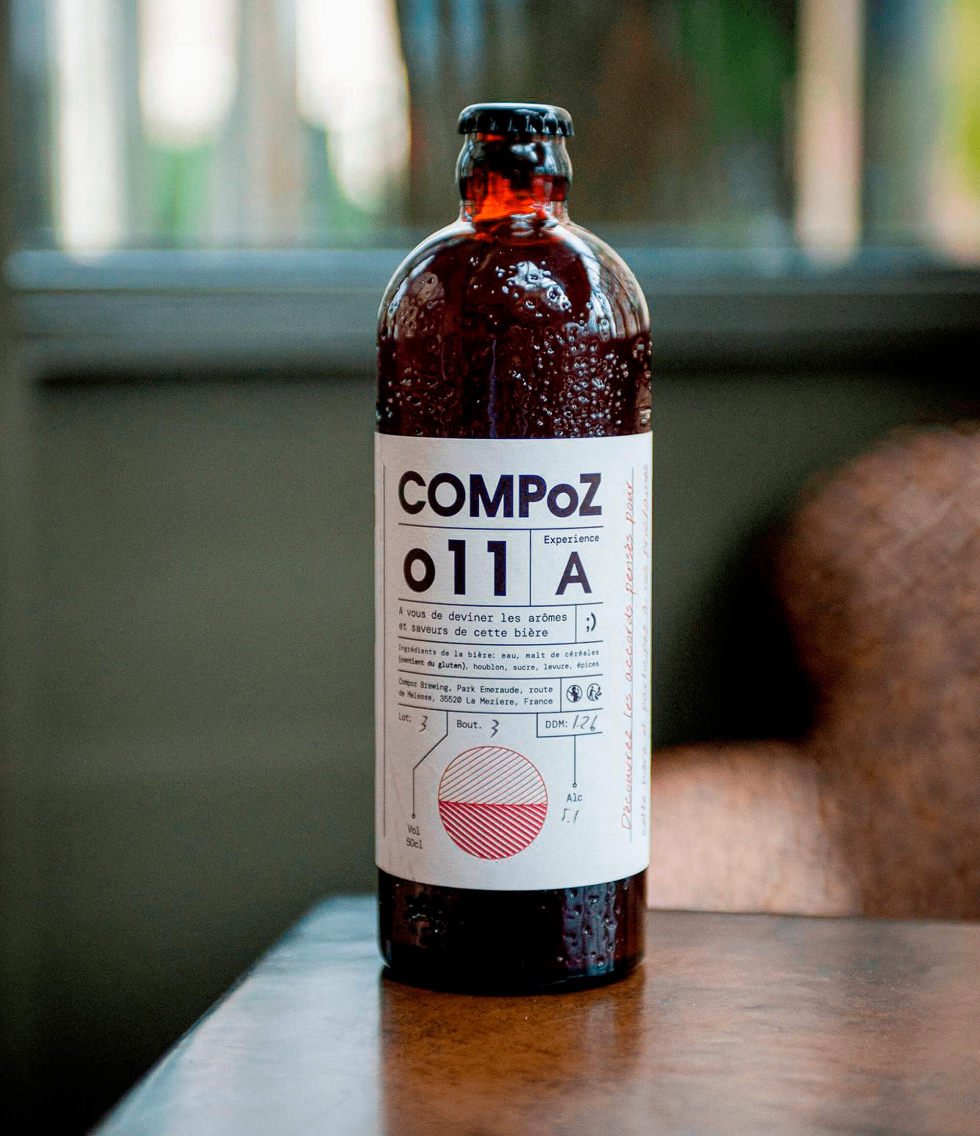
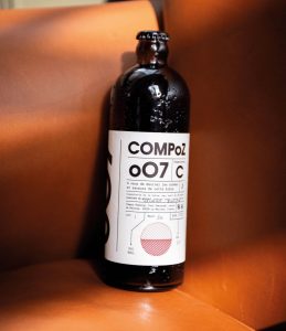
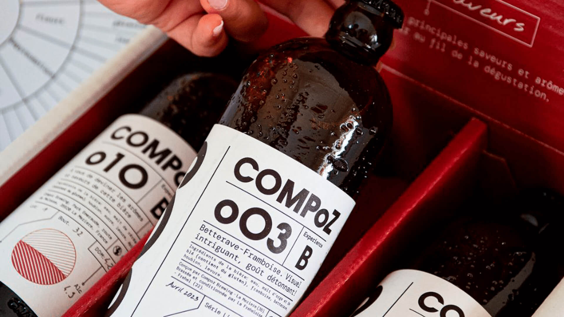
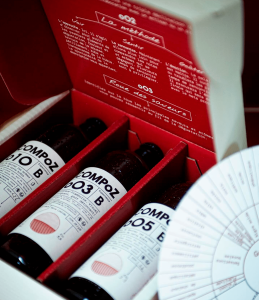
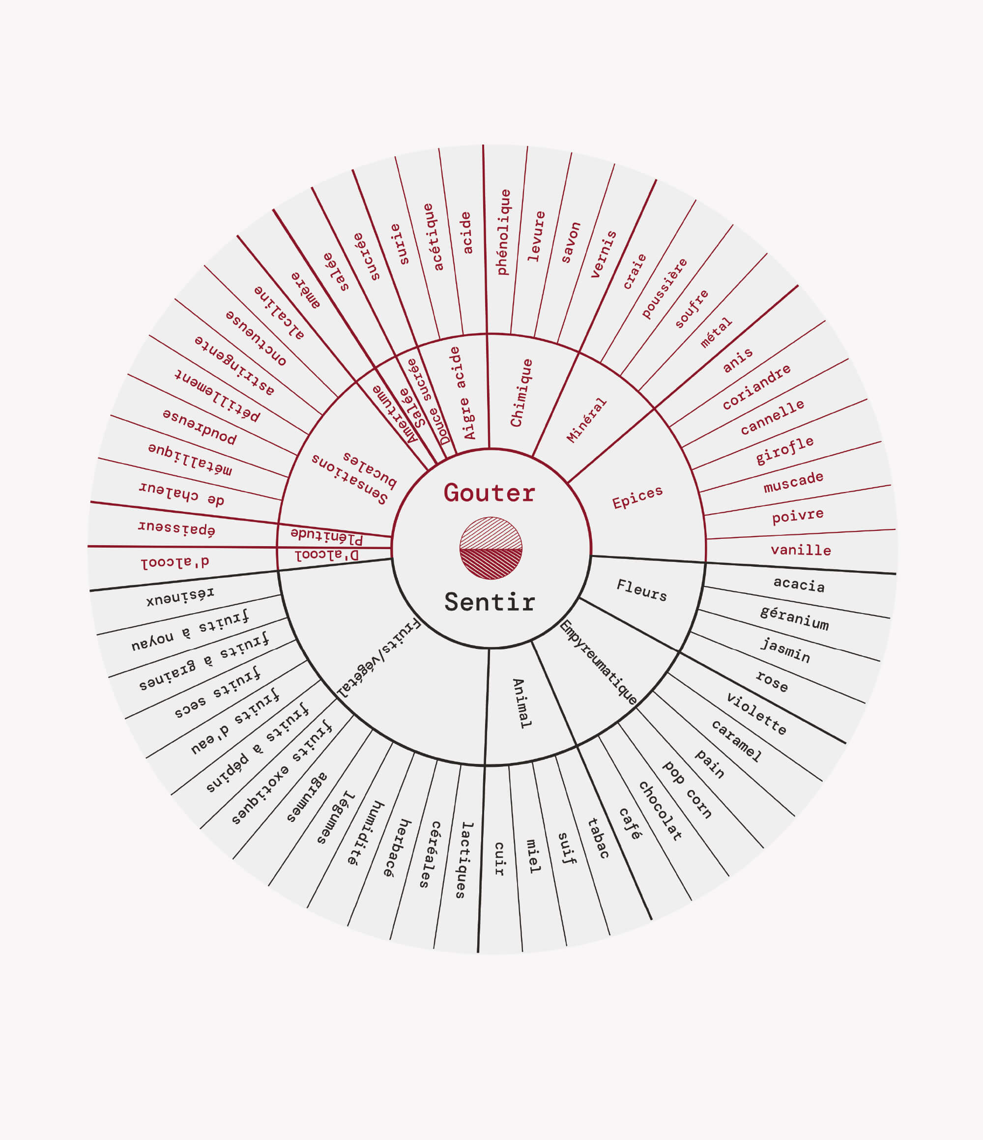
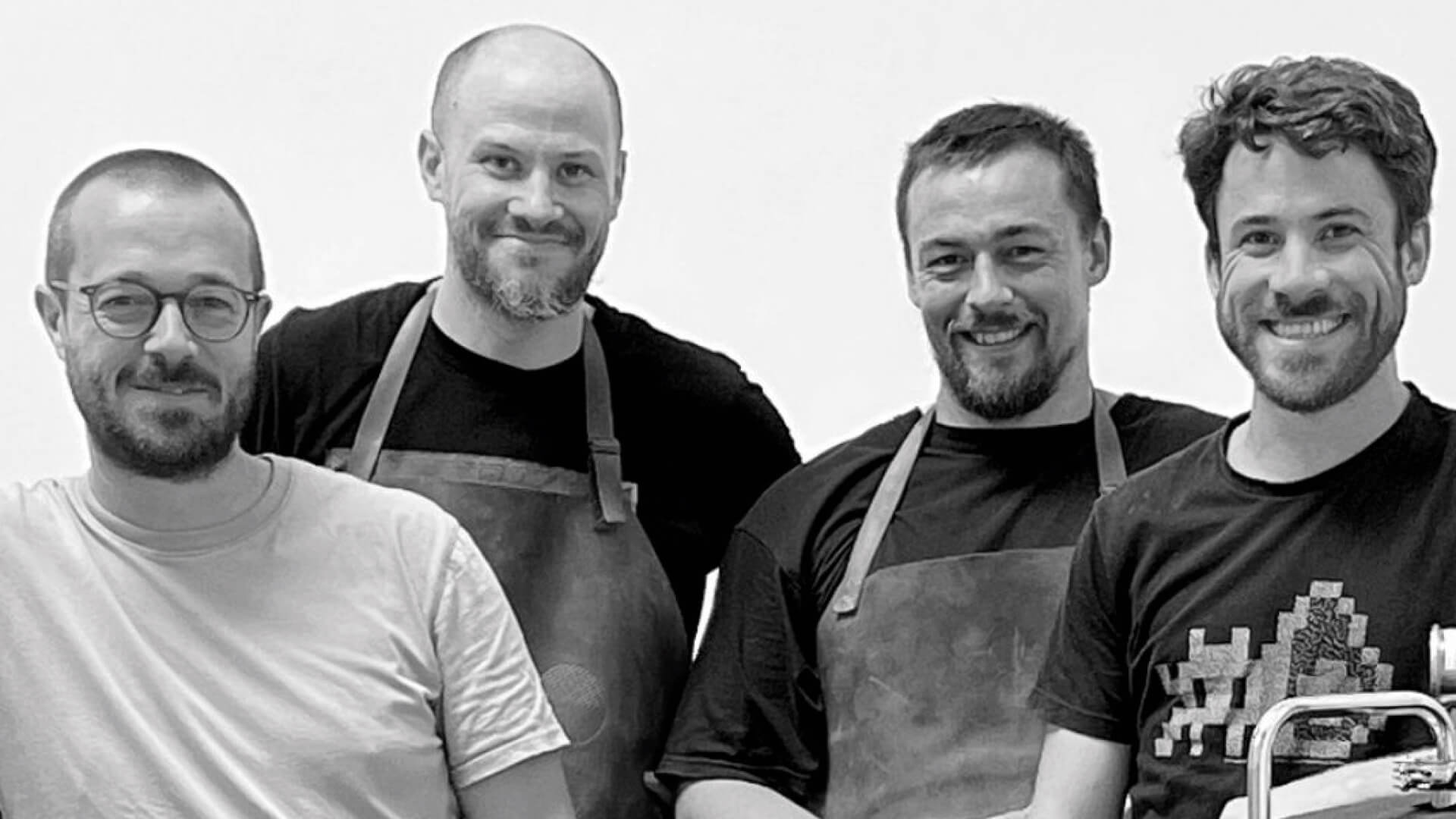
COMPoZ is a conceptually unique, custom-made beer produced in Rennes, France. Established in 2022 by four friends and beer enthusiasts, the brand was born out of a desire to take a more creative approach to brewing. I was thrilled when they reached out to me to develop the brand's identity and packaging for such an innovative beer concept. Each COMPoZ beer is part of a limited-edition series, carefully crafted in collaboration with Michelin-starred restaurants, passionate chefs, and sommeliers. The beers are specifically designed to pair with select dishes, bringing the art of food and beer pairing to a new level. In gastronomy, pairing is the art of harmonizing flavors, textures, and aromas to create a balanced and delightful culinary experience. With COMPoZ, this process is further enhanced by the chefs, whose personalities and culinary styles are reflected in the beers themselves. Designing the visual identity for COMPoZ was a fun and fulfilling experience. The goal was to 'compose' a graphic language that would immediately stand out, without resorting to traditional or urban design trends associated with beer brands. Instead, we aimed for an organic, handcrafted feel with a hint of science and laboratory precision—emphasizing their approach to the craft of beer making. The identity's key elements include the logotype, symbol, numbering and lettering system, as well as typography and colors. Each series is marked with a unique number (oO1, oO2, oO3...) and letters A, B, and C, as a collaboration can result in up to three distinct beers. Drawing inspiration from the natural process of osmosis, the symbol tends to connect two worlds and merge them in one unique experience. Creating a cohesive graphic system was essential to ensure the identity could evolve and grow over time in a consistent and recognizable way. Beers are presented in o.5L glass bottles with unique shape and texture characteristics enhancing overall visual experience. As a testing package o.1L bottles are chosen to highlight the scientific side of the brand spirit. Brand is firstly introduced to the public through direct monthly subscriptions, building a dedicated fan base one sip at a time. Each package includes three distinct beers in o,5l bottles (e.g., Series oO1-A, oO1-B, and oO1-C), along with a flavor wheel and detailed guide/questionnaire allowing brand to present approach behind the each series and encourage consumer to connect with the experience of interacting with the product. Join us in redefining the art of beer and food pairing, and let our carefully crafted brews elevate your culinary experiences. Santé!


CD, AD, Visual Identity, Packaging: Stefan Knežević
Photography: Linattendu Agency
Year: 2022