About This Project
Brand Identity and Book Design

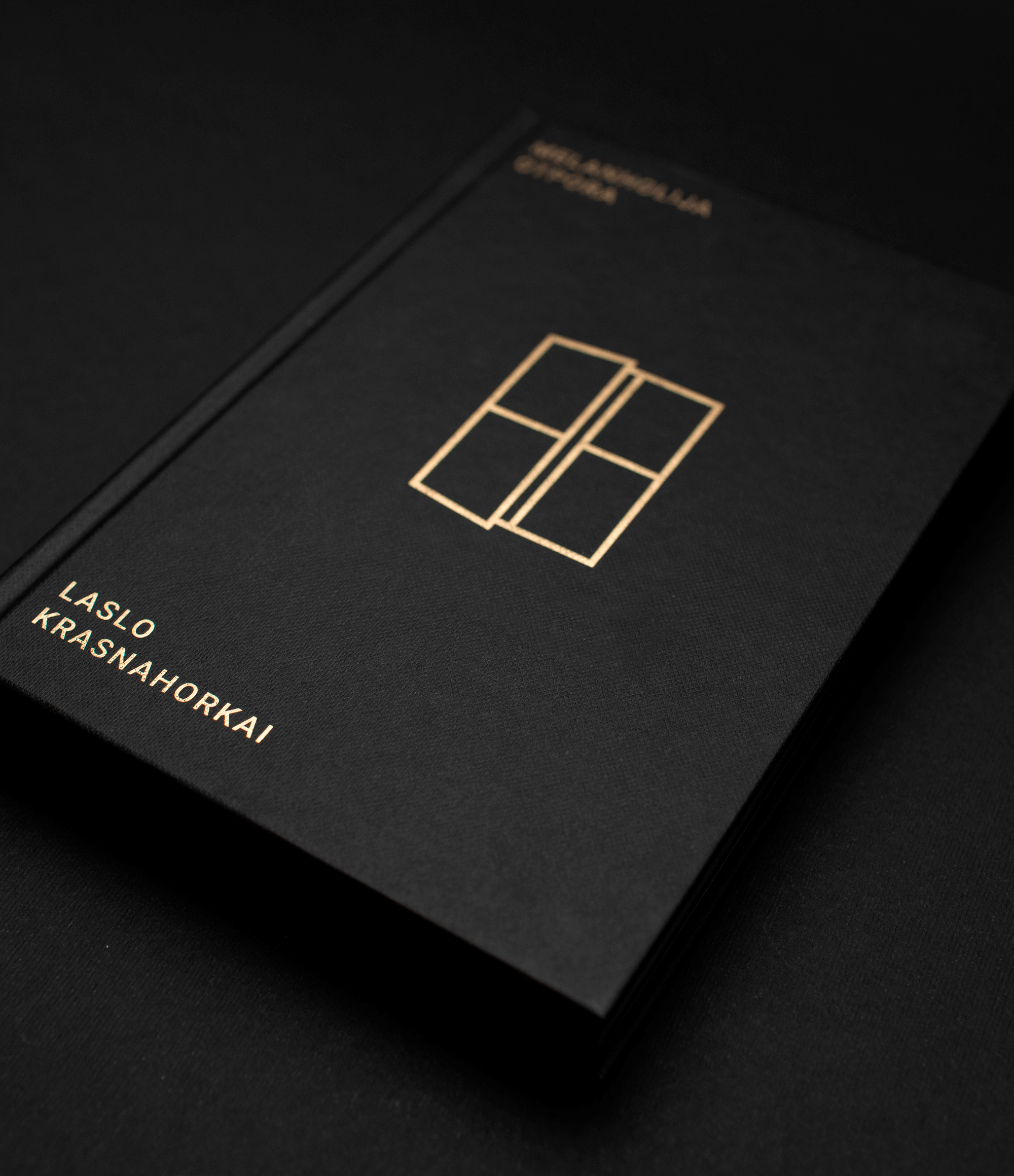
The brand identity and book design for Saturna Publishing House are inspired by the planet Saturn, whose mystique and symbolism shape the foundation of the visual language. The logo depicts Saturn and its iconic ring system, abstracted into the form of the Cyrillic letter С, referencing the name Сатурна. The color palette—gold and black—embodies the duality of light and darkness associated with Saturn, often referred to as the "Black Sun." This interplay of shadow and illumination is central to Saturna’s visual and conceptual identity. For Saturna’s debut release, Metafrast, a two-volume edition, the art direction was guided by a minimalist yet symbolic graphic approach. The covers feature fine line illustrations, distilled into near-abstraction, transforming imagery into evocative symbols that hint at deeper meaning. Each book includes a unique secondary symbol and pattern, thoughtfully designed to reflect an obscure narrative element or hidden detail from the story, inviting readers to engage with the text on a deeper level. Every material used in the book's production was carefully selected—not only to elevate the visual and tactile quality but also to imbue the physical object with symbolic significance, making each volume a sensorial extension of its content.


CD, AD, Visual Identity, Book Design: Stefan Knežević
Photography: Mika Knežević
Print: Alta Nova
Year: 2024