About This Project
Brand identity and packaging design

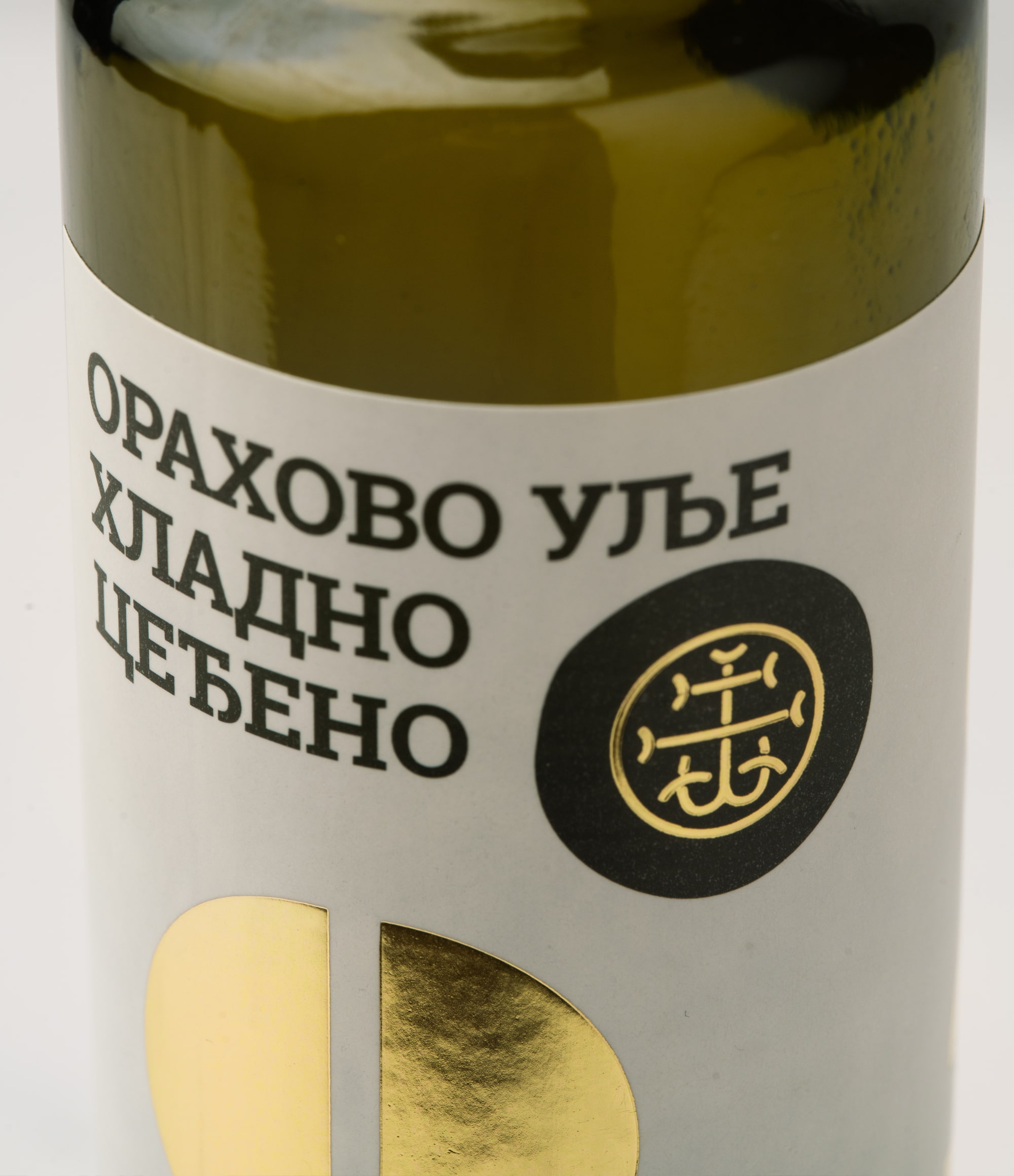
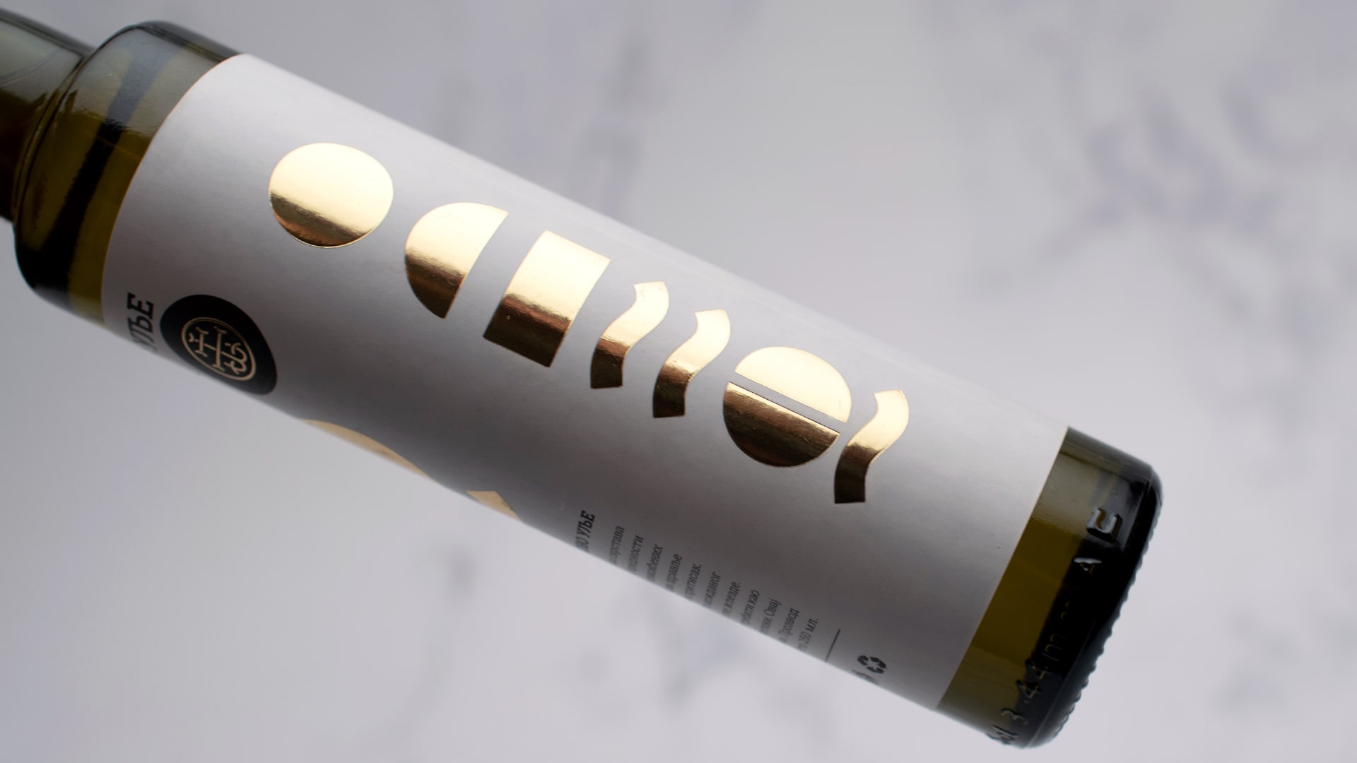
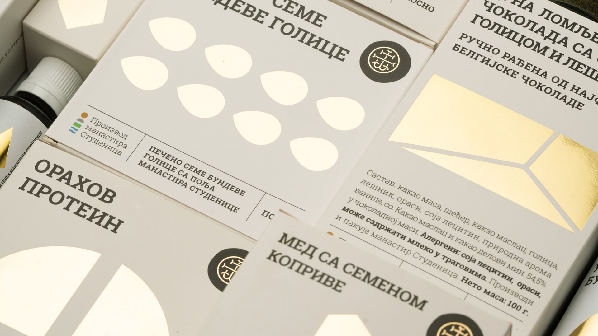
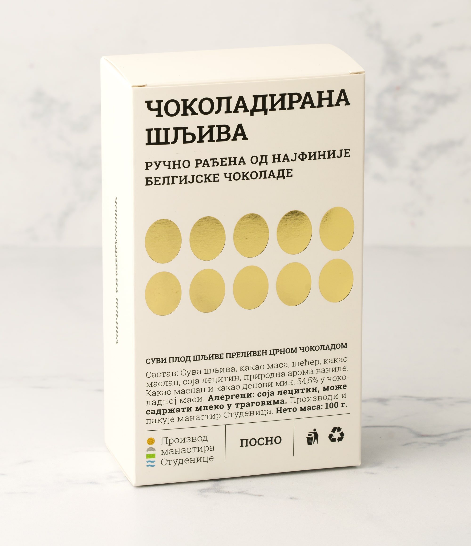
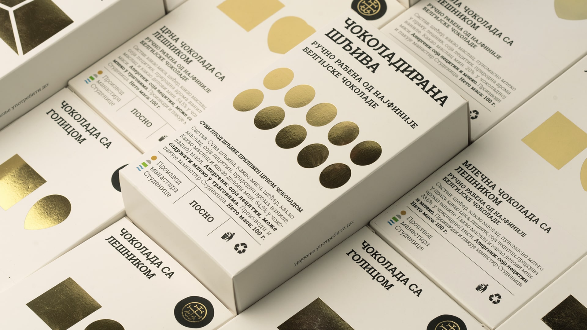
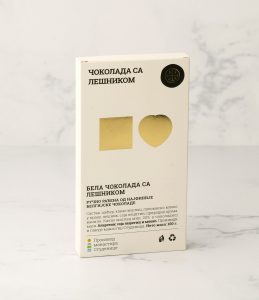
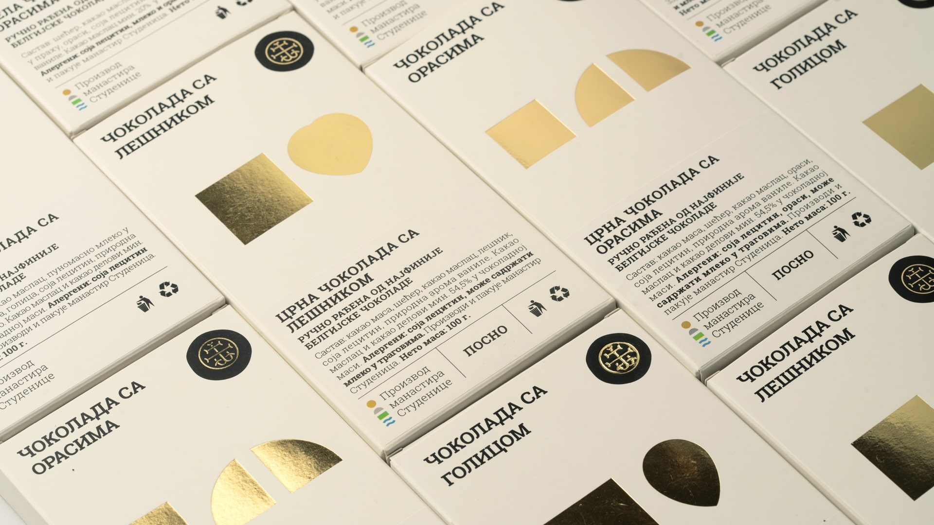
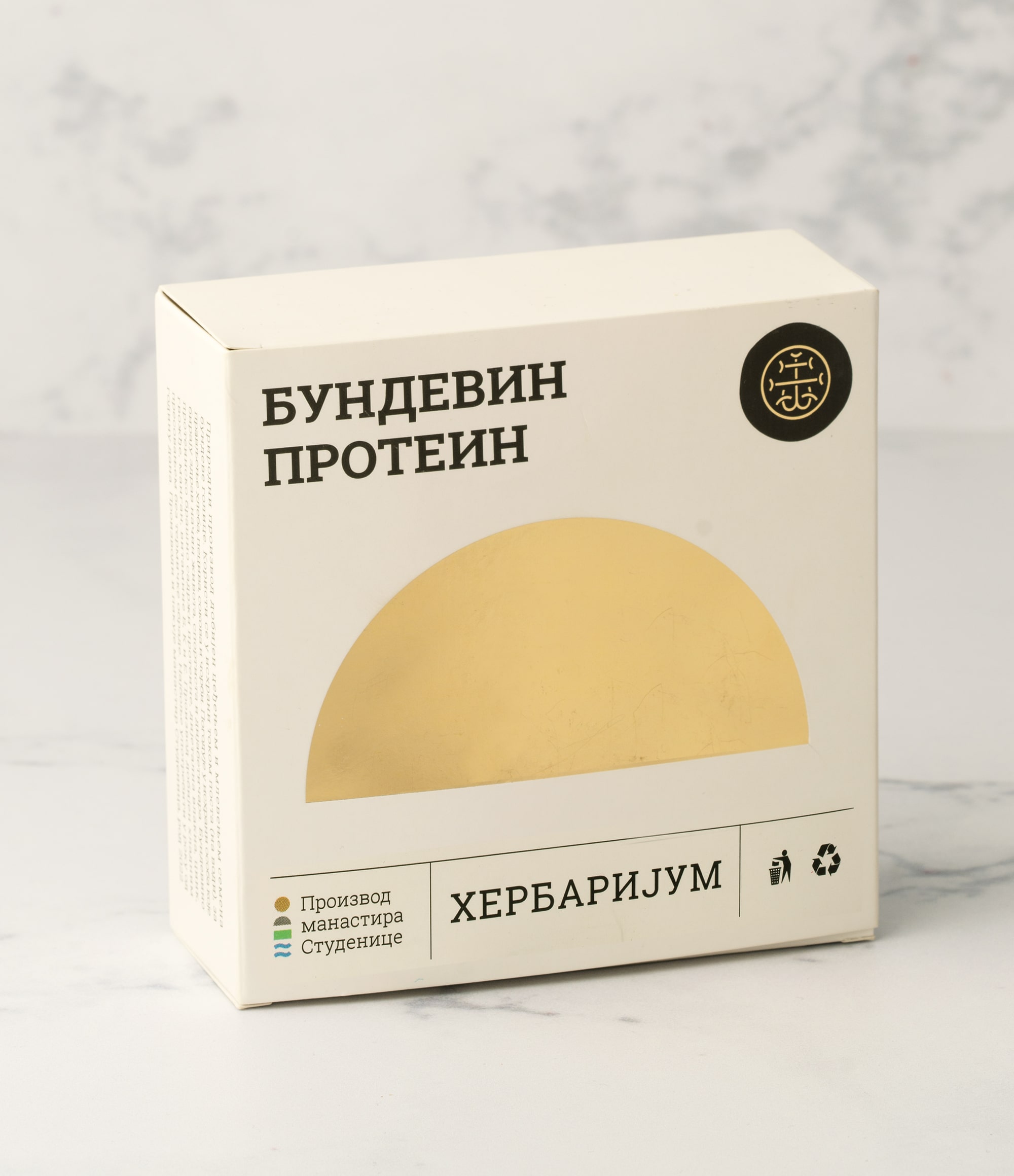
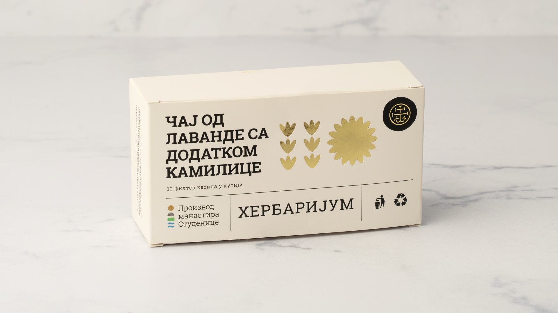
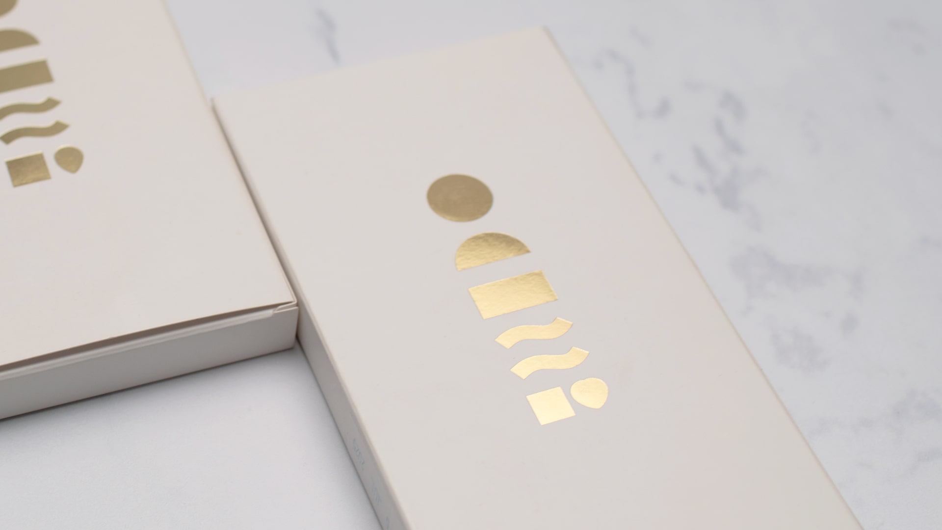
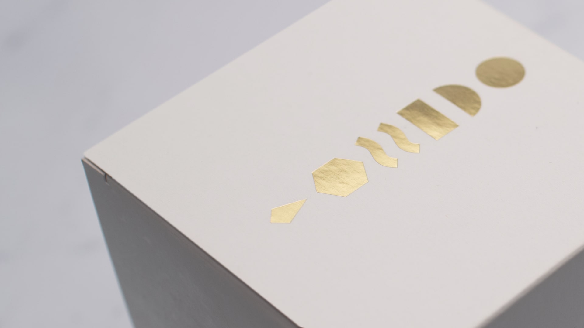
The Studenica Monastery stands as one of the most significant legacies of the 12th-century Nemanjić dynasty, representing a cultural treasure and a cornerstone of Serbian heritage. Beyond its religious purpose, the monastery has become a cherished tourist destination, attracting thousands of visitors each year. Guests are drawn not only to its spiritual and historical importance but also to its breathtaking natural surroundings. Today, visitors can take home a piece of this heritage through a unique line of high-quality natural products, offered as meaningful and memorable souvenirs. The visual identity of Studenica’s product line is built around a distinctive system of 25 individual symbols, each representing one product. Together, they form a unique and cohesive graphic language. The logo itself is rich in symbolism: it combines the image of the sun, the monastery roof, a fertile field, and the Studenica River—from which the monastery takes its name. Simultaneously, it evokes the figure of a human or saint, merging the divine and the earthly. The use of white symbolizes the iconic white marble from which the entire monastery is constructed, while touches of gold further emphasize the element of light—a nod to spiritual illumination. Each product package features a main symbol on the front, and a secondary symbol on the back, created by merging the product’s icon with the logo. This back design reveals a new, unique human or saint-like figure, adding depth to the visual storytelling. As a result, the front and back of each package offer distinct visual experiences, enriching the graphic language and making it both memorable and truly distinctive..


CD, AD, Visual Identity, Packaging Design: Stefan Knežević
Photography: Mika Knežević
Print: Alta Nova
Year: 2024